Biovalens
Product branding and development
Understanding Biovalens’ audience allows us to develop visuals that reflect the intention of the product.
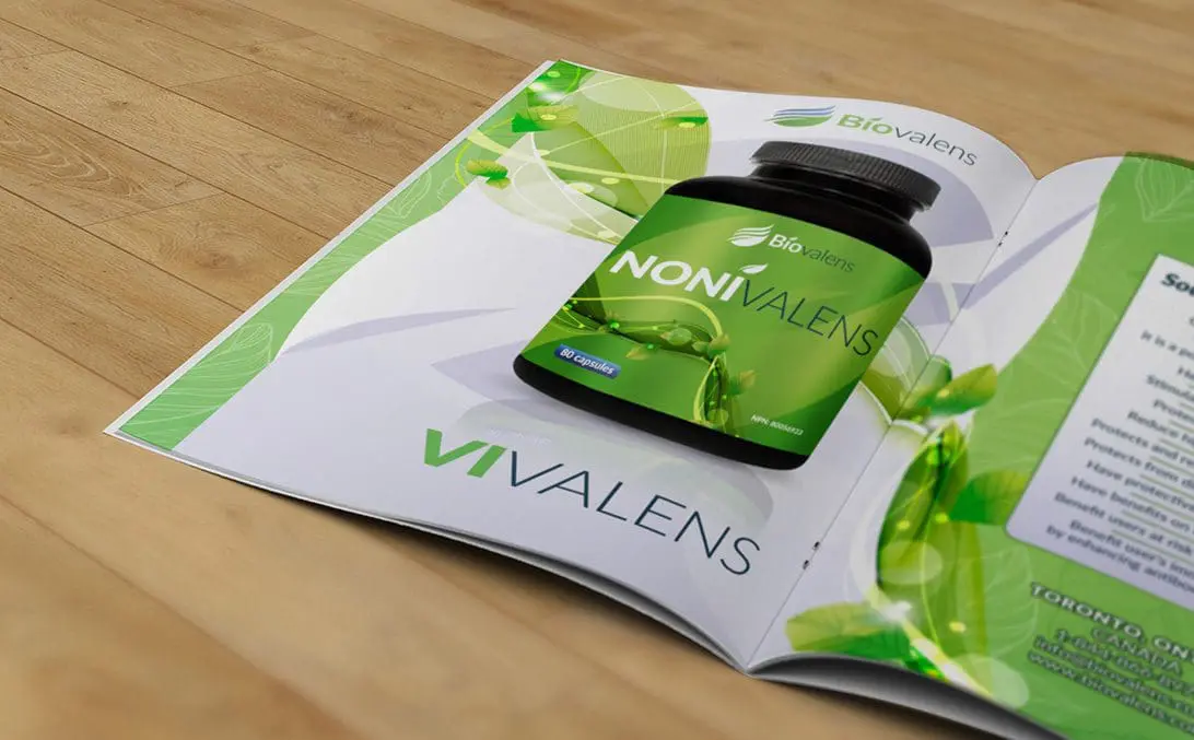
BIOVALENS BROCHURE
Our goal when designing this layout was to show one complete fluid design running across the spread. We carried our label design in the background to indicate the natural values of the product.
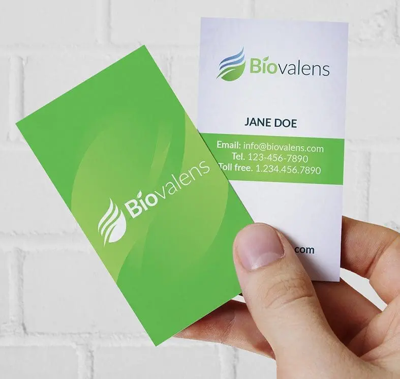
Biovalens Business Card
Keeping it simple was the rule and the request. Our client indicated that it was important to keep it very clean. This card was printed offset with mat lamination, the thickness was 16pt.
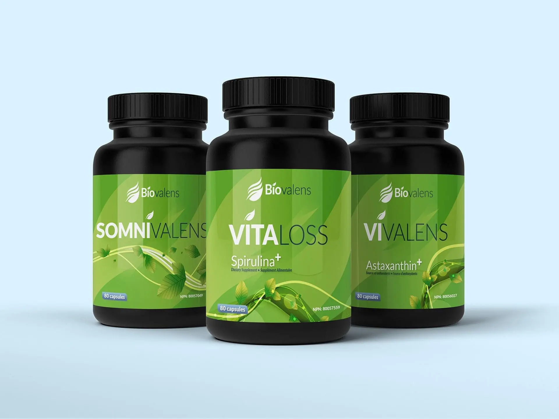
Biovalens Product presentation
In these 3 frames from left to right, we built the 3D versions of the Biovalens Packaged products. Our goal was to evaluate the color and visual representation of the product.
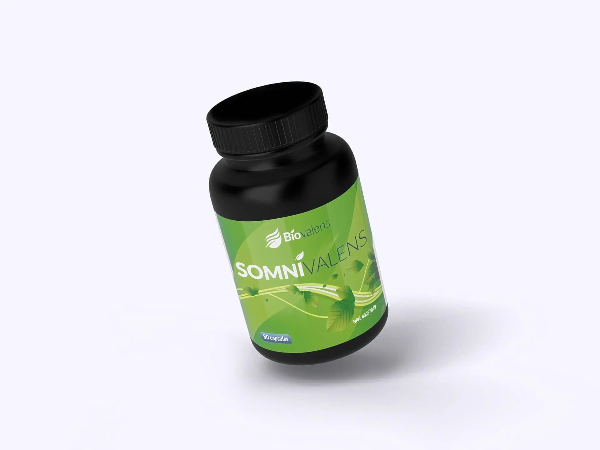
Biovalens Product presentation
It was important that we were sure that different perspectives were taken into consideration, here is a view of a single product when looking down.
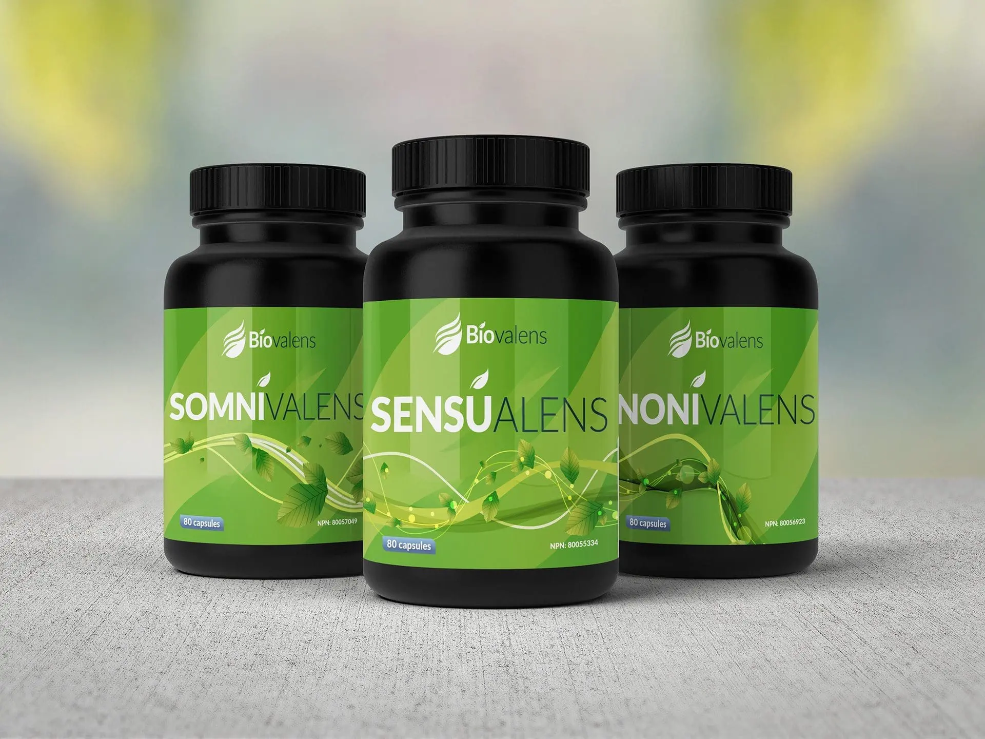
Biovalens product presentation
It was equally important to visualize the impact of the label/bottles using different backgrounds. Each label we created were married in theme that showed a natural fluent design, all different yet the same.
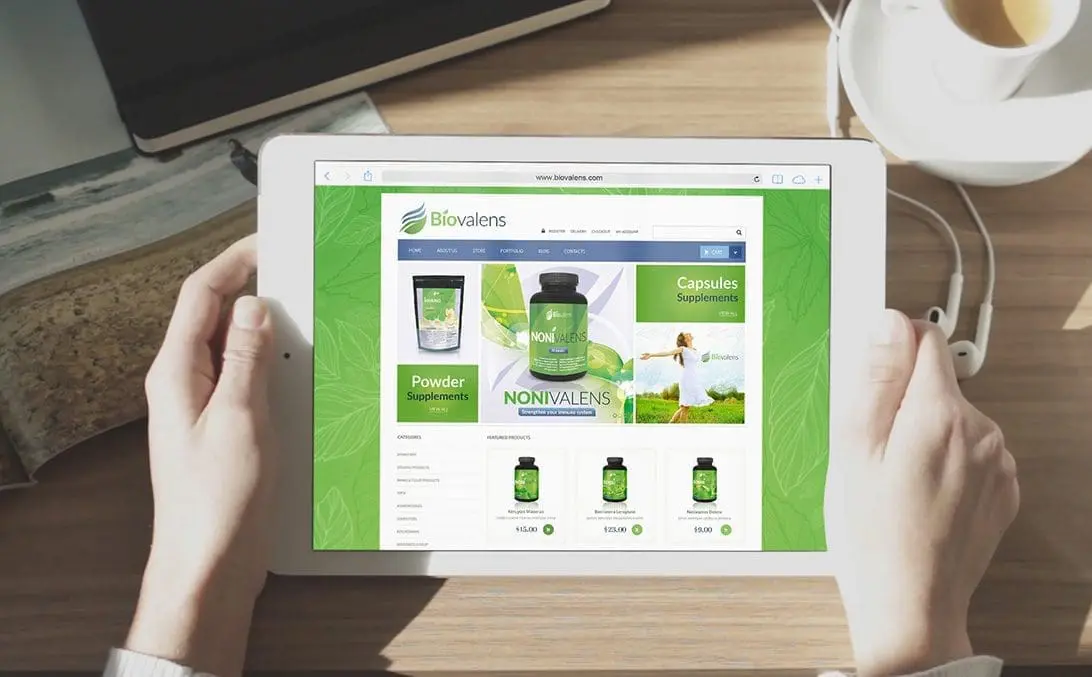
Biovalens e-commerce website
This original Biovalens e-commerce website was built on a Woo-commerce platform. Our goal was to make it fully responsive and user friendly.
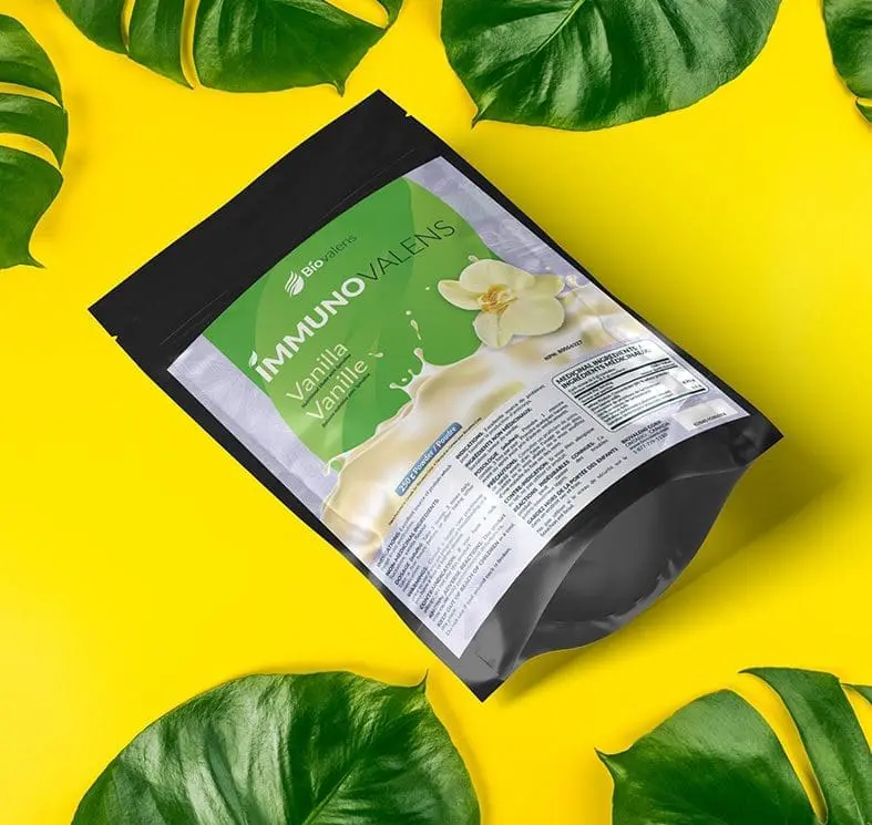
Biovalens eco-friendly packaging solutions
Biovalens also made it a point to look at other packaging options. This allowed the product to take up less shelf space and leave a much smaller footprint when the product packaging was discarded.
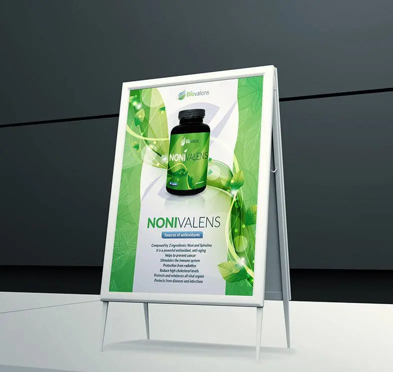
Sidewalk or entrance small banner stand
Having the right tools to promote your product and showcase its value. We proposed key solutions that allowed the products key visibility within the stores it is showcased.
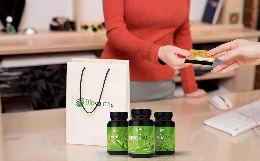
Biovalens Point of purchase products
Making sure the lasting memory and shopping experience is positive. A selection of bags, boxes and coupons are highly suggested in order to add value to the Biovalens product.
